Team
Finance
Overview
Redesigning how the Comparable Sales Report is created and its business process
Role
UX Design Intern
Timespan
May-july 2022
Tools
Tableau
SAP
Axure
Miro
Background
As Home Depot is a publicly traded company, their 10K and 10Q gets reported to Wall Street every quarter. As part of these reports is the Comparable Sales Report which contains information on how sales in the USA, Canada, and Mexico are doing in comparison to the previous quarter. Prior to my internship, this report was managed and inputted by a single person in the business department. He had to manually input sales figures during the critical month-end close period.
Problem
Since this was a manual input process, it posed a huge risk to the company as there was always a chance he could accidentally input a wrong number. In addition to this, he was under a time crunch to gather the figures and input them each month and each time he had to load the database to gather data took approximately 2 hours. This was extremely inefficient.
Project Goals
1. Partner with financial stakeholders to learn the entire business process and how the report currently works, gather any additional needs, and list their pain points
2. Identify any gaps in the report
3. Identify any risks associated with moving to a new automated system
4. Identify issues or pain points from both the business user and IT team
We also wanted to:
5. Interview our IT team and business user and use the findings to make recommendations that simplify the business process
6. Create a Journey Map of the user’s business journey
7. Create a Proof of Concept and a demo of the concept
8. Prototype what the new system would look and operate like in SAP (the business system used)
Problem Statement
How might we better present the data currently in the Comparable Sales Report to improve accessibility and ease of use for all stakeholders?
Research Approach
I began the research by compiling a list of business users that are involved with the report and IT users that created and manage the report. I then conducted interviews with them to find out more about their process with the report, why the issues exist, and where we could go from there. After many rounds of user interviews with business and IT separately and then unified discussions together, we finally reached common ground on the flow of the whole process of the report and everyone’s pain points.
Ideation and Storyboarding
From this, I created a Journey Map to depict user actions, pain points, systems being used during the respective process, and documentation for each step of the journey in the critical month-end close period.

The Journey Map helped the team have a shared understanding of the process and associated pain points, so that we could all make better decisions on going further. Moving from here, I compiled a list of pain points from each side and discussed with the Software Engineering interns on solutions or recommendations for each. Our business user had trouble with how the report was made in terms of UI, working with offline data, and waiting the 2 hours for the report to load. One of our main conclusions was to switch the report from Excel to Tableau so that the user can work with live data that can be pulled from databases easily and we could customize and format the report flexibly. We also created a plan to switch to a different system that would cut the load time by 50%.
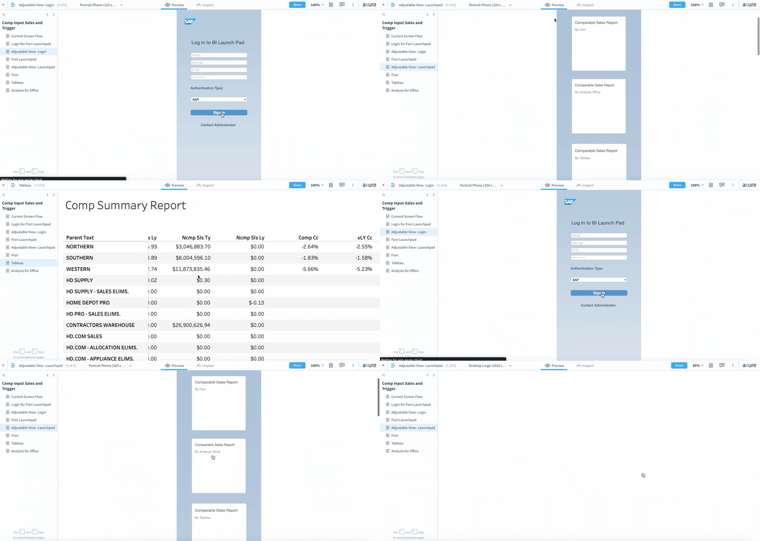
Prototyping and Testing
In Axure, I created a prototype of what the new system would look and feel like. I recreated the SAP system with the new reports and interactions. We demoed this along with the new Tableau report to the business user to show him what it looked like and how he can use it to complete his business task. We explained all the new features, formatting, and how to pull live data with just one button. After this, we let him use it in front of us to complete his usual tasks and give us feedback and suggestions on its usability and whether it took care of his pain points and satisfied his needs. He was able to perform his tasks 60-70% faster and loved the new changes. He appreciated that we customized the view of the report to his ease and said the Tableau report would allow him to perform in the critical month-end close period with much better efficiency and less stress.

Outcomes
1. Load time for the new report went from 2 hours to 1 hour.
2. Time taken to format the report went from roughly 80 hours per close period to 55.

